As some of you know, I work best with a purpose. Therefore, with the American Society of Bovine Artist's Second Ever Show coming up next month, and no new cows to show, I decided to get crankin'!
So I searched my old cow compositions from my 'longhorn' files, and

this one was the first that caught my eye. I had put it together from 4 photos a while back.
But with a fresh look at it, I thought it needed some work.

Some repositioning of the calves, and a bit of strategic cropping, and I liked it much better!

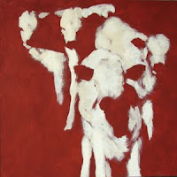
Here is my underpainting of the pastel primer on Gatorboard (my favorite surface!) I use Art Spectrum Pastel Primer in terra cotta, with a bit of burnt umber mixed in, for my 'default' base color. For this image, I also used some sand and some white for the lightest areas of the calves. I thought this looked so cool I almost didn't want to paint on it!

Here are the first underlying colors. I like to work all around the painting and get the basic values in so I can see how each area affects the others as the painting progresses.
I decided at this point that the background was too dark, and contrasted too much with the line of white cow backs.

I wiped off most of the tree line and put a sky (or water) line at a slight left diagonal to offset the strong right diagonal of the cow group. At the same time working on shadow tones, grasses, etc.
Now, I liked the dark grass at the top right, but felt it didn't have a
reason, so I added a tree.

I liked how that added an anchor at the top and turned the composition into something like a lower case 't'.
While working through the shadows on the white calves, I wanted to keep them from appearing too dark for reality, also my frame for this is a pale yellow-gold, so I've imagined this finished piece as being fairly high-key.

Here the shadows are coming along...
And decided to fatten the tree.

A close-up of the 'Leader.' Isn't he cute! (Looks like a troublemaker for sure!)

The background always gives me the most trouble...

I
thought I was done at this point, until I saw it on-screen... (amazing how photographing a work can help with critique!) The tree was too dark for the distance, and I didn't like the yellow grass to the side of the right calf's face.
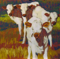
...And here it is! "Leader of the Pack"!

(...OK, I
thought I was done with this, until I saw it on-screen... lol!)
I
might do away with the tree after all,
and the yellow grass in the upper left... But it's too late tonight to deal with it. I'll leave it a few days and take another look.
Thanks for reading! Hope you enjoyed the process!
(Ignore the slight color changes between photos. Most were taken at various times of the day.)
 Recently in my online wanderings I came across the blog of watercolor artist Paul Jackson, who has created the site "Art vs. Oil Spill", an online store featuring a collection of
 artwork donated by more than 100 artists around the the world specifically to benefit wildlife rescue operations along the Gulf Coast after the BP oil spill disaster.
 I was so taken with this idea, and the opportunity to help, that I sent in the images of my 6 new 'beach scenes' (birds and dead fish), and I'm thrilled with how they look on all the Zazzle store products!
 Check them out! Proceeds from purchases will benefit the Wildlife Rehabilitation and Nature Preservation Society, an all volunteer registered non-profit organization.


